Raptor Oil Raptor Oil has been through a very successful period of growth and investment and it was key to reflect this in the brand and holding page online. www.raptor-oil.com
Brand Update
Over time every company will require a brand refresh, sometimes this can be minor updates and other times there's a requirement to make wholesale changes to reflect a brand re-position.
In Raptor Oil's case, their logo required modernisation. Our first objective was to redraw the Raptor symbol, ensuring it was going to be strong enough to sit alone on products and simple enough to print with one colour. The second objective was to revisit the typography to ensure there was balance between the symbol and the text.
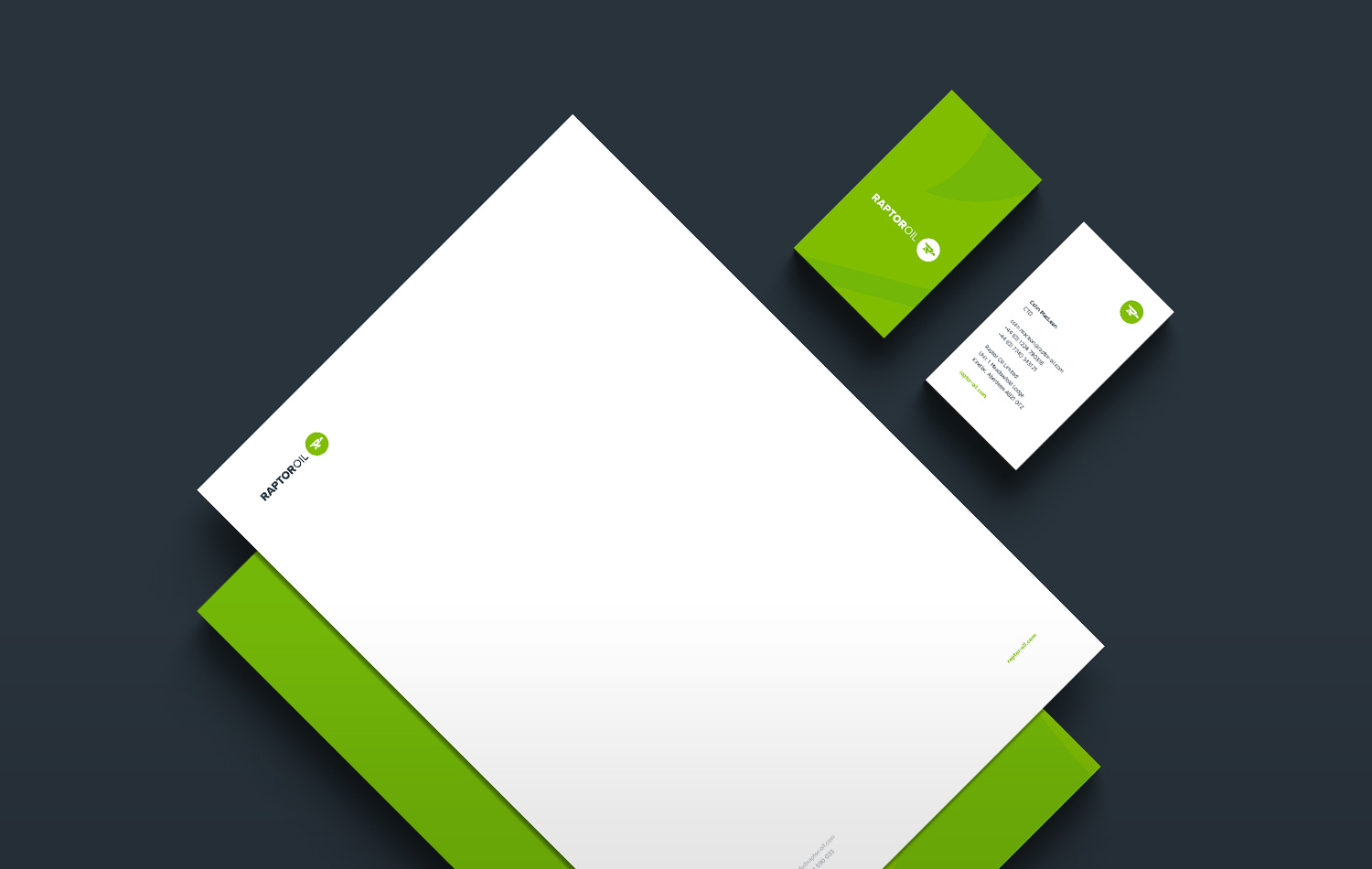
Business Cards & Stationary
On completion of the brand update we created new business cards and stationary pack. Reflecting the strength of the logo, we wanted to design stationary similarly bold in appearance. We wanted a contrast between white space and strong colour. To achieve this we sat the logo in white space, where the eye could focus with little effort. To create the contrast, we double-sided the letterhead and business cards, using Raptor Green.
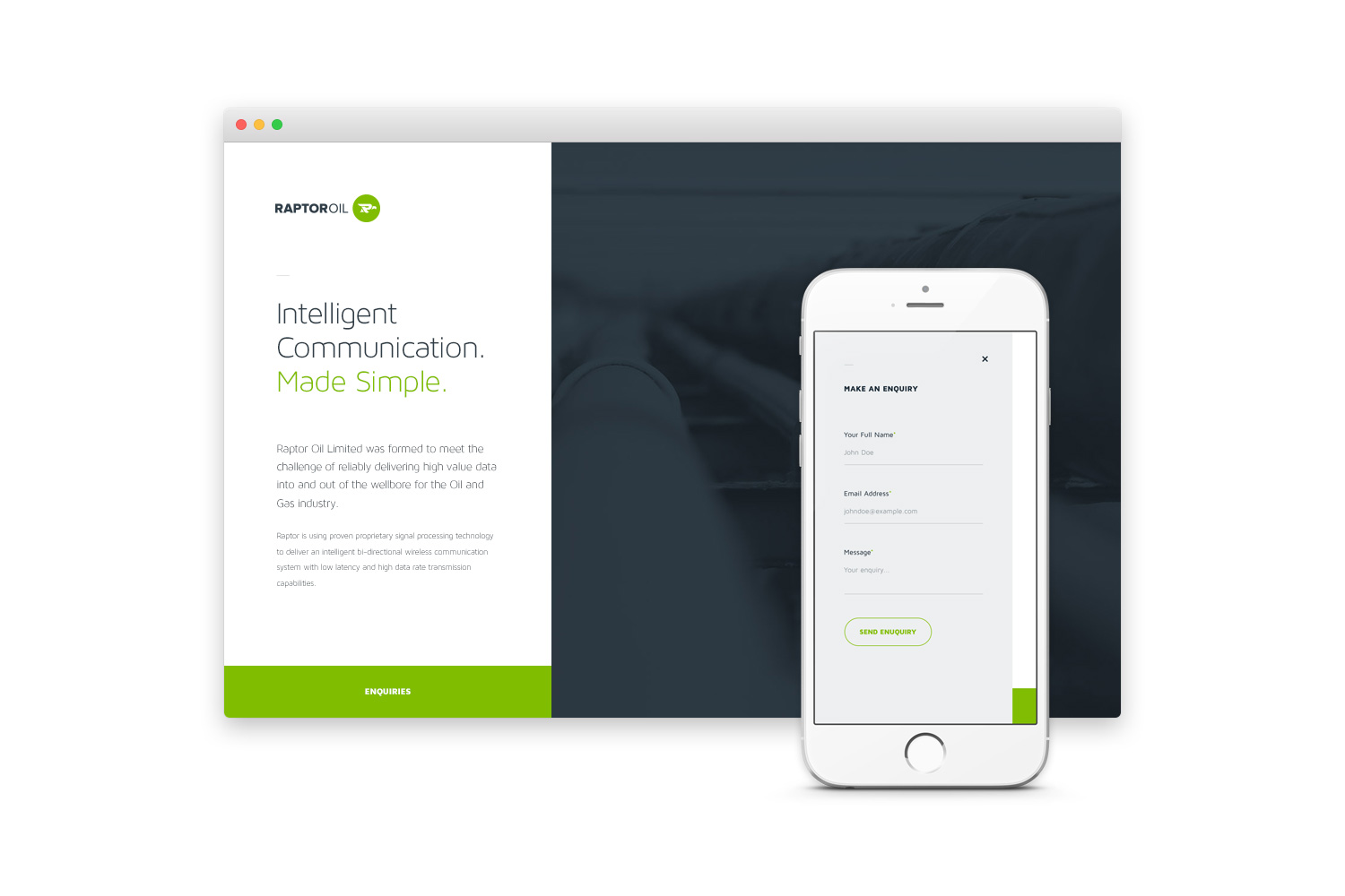
Responsive Holding Page
Lastly, in preparation for the full website, a holding page was created to reflect the refreshed brand. As with all our new web projects, the page is responsive to ensure best practice.
-
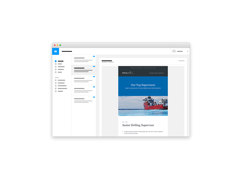
Email Marketing Campaigns
-
Strategic Resources
Website

-
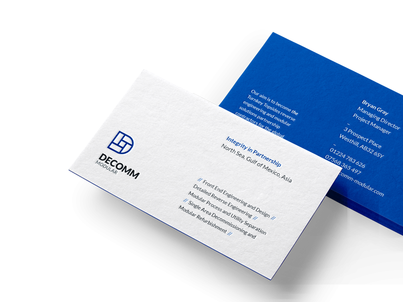
Decomm Modular
Branding & Holding Page
-
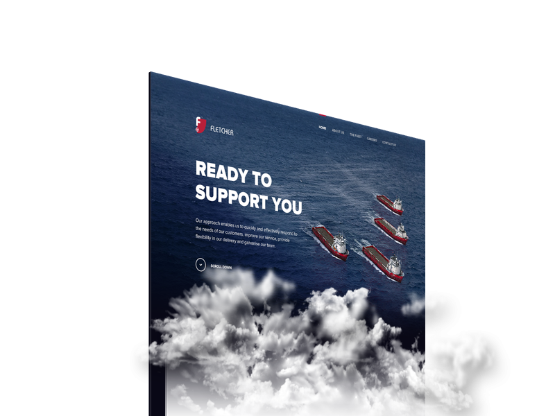
Fletcher Shipping
Website
Our team is always ready to work with exciting and ambitious clients. If you're ready to start your creative partnership with us, get in touch.